danbricklin.com/log
|
|
|
|
Ballot Usability in Florida
|
Jakob Nielsen has been insisting for years that usability is real important. I've written on this web site about how important we feel it is at Trellix Corporation. Well, here we have a new, about-to-be-a-classic example in another domain. (See The Big Picture, at the end, too.)
What is the issue?
In the oh-so-close Presidential race in Florida, a major issue is whether some of the votes that went to Pat Buchanan were really meant to be for Al Gore. Larger-than-expected Buchanan numbers in some areas known to have only elderly, Democratic-leaning voters, along with complaints about ballot usability by those people, brought this to national attention. I heard about it from a relative in Florida before the voting closed.
What was the ballot like?
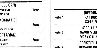
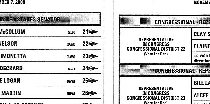
In the West Palm Beach area, like many other localities, you cast your vote by punching a hole in a card with a stylus. There are paper ballots that indicate which hole corresponds to which candidate. (See this example page from Missouri.) A 1998 Florida state law made it easier for minor-party candidates to get listed on the ballot (the last Presidential election was 1996). Apparently, this led to there being 10 parties plus space for a write-in candidate for President. The names were listed alternating left and right on the Presidential ballot, with a single column of punch-card holes down the middle between the rows. Al Gore was second on the left column, Pat Buchanan first on the right. Gore's voting hole was number three, Buchanan's number two. There were arrows which covered a certain fraction of the distance to the column of holes. On other parts of the ballot (for Senator and other offices) there was only one column -- the first name corresponded to the first hole, the second name to the second hole, etc.
This situation sounds like it is full of classic usability questions. I wonder what the usability testing for this was like, or even if there was any such testing.
You can see pictures of the ballot and instructions on the Palm Beach County Supervisor of Election's web site and on some of the sites listed below. Here are some snippets (the pictures are linked to the originals):
The Presidential ballot: Two columns (the holes for punching are not shown in this sample -- see next paragraph)
Other ballots: One column
What isn't obvious from these pictures is exactly how the ballots aligned with the holes in real machines. Boston.com has an AP picture that shows one situation with a real holder. The Sun-Sentinel has a "Virtual Ballot" with pictures that show the alignment. The artist's conception many others are showing doesn't look as realistic.
Another issue is the Sample Ballot that voters were supposed to use to prepare. I have a separate web page, The Sample Ballot, with photographs of the pages of one of those booklets. (The images are large computer files.) You can see whether that was helpful or confusing in comparison to the actual voting situation.
Some obvious situations in which people could make mistakes
Kevin Fox shows how people could read the ballots different ways on his Basis for Alternate Interpretations page (with illustrations). People interviewed have said some thought you needed two votes: one for President and one for Vice-President. Slate presents yet more analysis.
There is a question about how could people not know that punching two holes was a mistake. Well, most people are no longer familiar with punched cards like some of us were in the 1960s. A common thing where you push something in is a car radio. You can push as many times as you want. Only the last one counts. Wouldn't you expect a voting machine to let you change your mind or keep you from voting for too many? The old lever-operated ones do. Some people might have expected that.
Usability testing should have shown how common these situations were and whether or not they should have had any effect. Guessing what people might have thought isn't enough. That doesn't tell you how common that mistake would be.
There is some data to help determine what people may have intended and to help in understanding the usability issues. Palm Beach officials listed the combinations of multiple punches on a sampling of the precincts late Saturday night after the election (4,200 ballots were hand counted -- about 1% of the total). There were one or two instances of many combinations, but three hole combinations stood out with more than a few instances. (This data is from an email I received, but I saw the press conference on TV live and it seems OK by what I recall. Let me know if I'm wrong.) Holes 3 & 4 happened 11 times (Bush & Buchanan), holes 4 & 5 happened 80 times (Buchanan & Gore), and holes 5 & 6 happened 21 times (Gore & McReynolds). The ratio of Gore to Bush votes in the original count was about 1.8 to 1, similar to the ratio of the hole 5&6 ballots to the 3&4 ballots. (This could be people who mistakenly punched the holes next to both President and Vice-President candidates, voting for the "Group" as the instructions listed. One could argue that Gore supporters were just as prone to error as Bush supporters in making this mistake.)
The Big Picture
I have heard from a variety of people about voting instrument confusion in many states, not just near West Palm Beach Florida. We know from lots of examples of usability studies that errors on tasks arising from "dumb mistakes" are very common, with rates of easily 5%, 10%, or more. Elections, even important ones like for President of the United States, are often decided by much slimmer margins than that. In our ever-mobile world, thorough testing of ballot techniques and standardization may be called for if we are to believe that we truly choose our elected officials rather than flip a coin.
We should address this problem not just for the current election in Florida. In some areas usability should be given as much concern as voter and official fraud because it probably has a greater effect.
Note that this instance was caught quickly because only one county had the problem ballot (take a look at a statistics teacher's scatter plot where West Palm's data sticks out). When everybody uses the same flawed system you don't always see the anomaly so easily. For example, there is research that says shorter people don't vote on ballot questions as frequently as taller people because the questions are displayed way above their eye level on voting machines. Who would ever suspect that?
Usability: My perspective as a software developer
Like many other computer software developers, I have had to deal with usability questions my whole career. Creating VisiCalc involved figuring out how to make a calculating tool that was easier than the back of an envelope so people would do their first calculation on a computer spreadsheet so that their second one could be automatic. At Trellix, we have been using usability studies to ensure that our tools could be used by regular people to create great web sites by themselves. We have a lab with video cameras, one-way mirrors, etc.
I can tell you, regular people get tripped up by the simplest things. It is sobering to observe a test where a user repeatedly asks "How do I go to the next step?" and you want to scream "Click the 'Next' button!" that they just somehow can't see. You thought the button was obvious, but, as anyone who's missed a highway exit learns, in the real world what's obvious to one person who knows the answer is not always obvious to a newcomer. People who are making fun of the voters who made mistakes should think about the obvious mistakes they've made in their lives. If "most people" never have problems doing simple things why were there so many flashing 12:00s on old VCRs?
The difference in this case looks like it was an error of only 0.75%. However, there are reports that almost 20,000 Palm Beach ballots were disqualified because voters punched more than one hole, perhaps because they caught their mistake and then punched the one they really wanted (4.4% -- an apparently high number). Would usability testing (which often only uses 5-20 people of each background) have caught it? I think so. People's confusion, false starts, questions to the person running the test, hesitations, etc., all can point out potential problems even if the actual final performance is without error. In this case, so many people complained afterwards (when such complaints would have been embarrassing before the closeness of the election was known) you know a test would have discovered it.
Usability is important in many areas. Read this letter I received about its role in safety and environmental protection.
There are news reports about a simple ballot test with children, but not a real usability test. To learn more, read "A Ballot Usability Test".
Related links
What is Usability Testing?: A list of links to articles on the UsableWeb.com site.
AP story on Boston.com: Includes photograph of ballot in the holder showing the distance and alignment of the arrows with respect to the holes.
Previous OSU research on voting machine difficulties: Complaints about punch card systems and problems with voting machines for shorter people.
CHI'95 Workshop on Bias in Computer Systems: The design of a system such as a voting machine can bias the results in favor of different constituencies.
Useit.com Spotlight November 8, 2000: Usability problems in New York.
OrlandoSentinel.com story Steve Friess: Detailed story about the ballot confusion, along with another story that has officials' reactions about whether or not the ballot was confusing. Also, see the Sun-Sentinel "Virtual Ballot" with careful photographs that shows the alignment.
Statistics teacher's weblog: Data plot showing unusual Buchanan numbers. (I think Tufte would be proud of using graphs this way to highlight aberrations.)
Florida Voting Laws: About the standards for ballots, etc.
Harvard Researcher's Analysis of the Voting Numbers: Detailed look at the statistics of the Palm Beach voting, showing a relationship between irregularities and support for Gore.
The Sample Ballot: Large images of pictures taken of the Sample Ballot (not the actual one with the punch holes).
|
|
|
© Copyright 1999-2018 by Daniel Bricklin
All Rights Reserved.
|

